
Maternity Hospital App

66%
reduction in wait time from 3 to 1 hour
50%
reduction in touch points from 8 to 3-4
01
interface for all hospital functions
INTRODUCTION
Redd was tasked by Cloudnine, India's leading Maternity Hospital, to create an application that would become the primary way in which a customer would interface with the hospital. I was Lead Experience Designer for this 6-month long project, and spearheaded the ideation & design of this mobile application.
MY ROLE
Field research · Journey Mapping · Information Architecture · User Experience Design (UED) · Process Design · Visual Design
TEAM
1 Product Designer · 1 Graphic Designer ·
4 Stakeholders
TIMELINE
July - Dec 2018

THE PROBLEM STATEMENT
When patients go to hospitals, much of their satisfaction depends upon the people they interact with, the time they spend there and the ease of the experience. Healthcare in India has not been as highly invested in technology as it is in other countries but it is starting to see some investment. Especially in a densely populated country like India where the daily traffic in hospitals is high, a hassle-free hospital experience can only be delivered through the use of technology.

FIELD RESEARCH
Our goal was to understand and map the user journey through the hospital. From the moment a patient arrives at the hospital until the moment they leave, we wanted to see what was happening on the hospital floor.
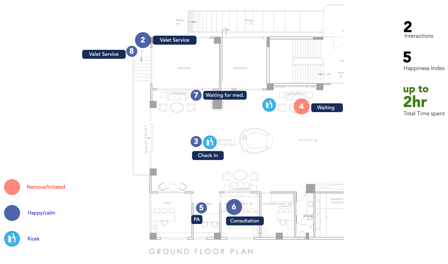
We started by asking ourselves 3 key questions. Then, we mapped the existing touch points using an architect’s map of the hospital floor.


HERE'S WHAT WE FOUND
😮💨 There are 8 Touch points
Patients usually go through 8 touch points between arriving at the hospital and actually seeing their consultant. A majority of that time is spent feeling nervous or irritated.
🗣️ Patients speak to 7 people
Patients speak with up to 7 people: a customer relations executive, a receptionist, a doctor's PA, nurses, a senior consultant, pharmacists and lab technicians.
⏱️ Average wait time is 5 hours
The total time it takes from the moment they walk into the hospital to the moment they enter their consultant’s office can be up to 5 hours.
😡 Most of the time, users are irritated
At 5 of 8 touch points, patients seem to be nervous, irritated, or both. These seem unnecessary and can be avoided with an app.
MAPPING THE EMOTIONAL EXPERIENCE
Asking maternity patients to go back and forth from a customer relations executive in the waiting area, to an admin at a hospital reception, to the consultant’s personal assistant outside the doctor’s office causes unnecessary stress.

Mapping the emotional experience of the patients based on the touch points we identified enabled us to understand which elements were stressors during the visit, which ones were important and which could be avoided.
USER RESEARCH
We interviewed 15 patients & partners about their experience at the hospital, 4 doctors about their experience working in the hospital, and several hospital staff. This is what they had to say about the areas of improvements:
PATIENT INTERVIEW FINDINGS
⏳ Wait time for doctor was 2-3 hours
8 people said that the wait time for appointments was 2-3 hours on an average
👨⚕️Staff interactions could be improved
6 people came to the hospital for a great doctor, but their experience with hospital staff could be improved
🚫 Not informed doctor would be delayed
Prior to arriving at the hospital, 5 people said that they were not told that their doctor would be delayed due to an emergency
👨👧 Fathers feel alone & want community
4 first-time fathers wished that they had a community where they could connect with other first-time fathers about what they're going through

DOCTOR INTERVIEW FINDINGS
🗄️ Only physical hospital records
4 doctors relied on their assistants to compile all the hospital records of a patient prior to their consultation
❓ Many follow-up questions
3 doctors said that patients had almost as many follow-up questions after the consultation as they had during it
☎️ Frequent calls post appointment
3 doctors shared their personal number with patients as a means of contacting them, but patients often times didn’t respect the doctor’s privacy
📄 Reports had to be picked up
3 doctors said that patients were asked to come back to the hospital just to pick up a report when it was ready & digital reports did not exist
STAFF INTERVIEW FINDINGS
🔁 Staff changed quite often
Their knowledge about procedures and processes varied quite a bit, quite possibly influenced by the staff changing quite often.
🤷 Clueless customer relations managers
There were a few redundant procedures where some of the CRM staff got in between the doctor and the patient and became a cause for irritation for the patient.
KEY TAKEAWAYS
Based on our field & user research findings, we then identified 5 key problems that needed to be solved

Reduce wait-times
The most frequent points of concern for patients were around the wait-times and the unpredictability of the doctor’s appointments. This was a key problem that needed to be solved.

Better doctor-patient matchmaking
Choosing a doctor to be in charge of your baby’s birth is a more involved process than just viewing the key stats of the doctor. A better doctor-patient matchmaking system needed to be devised.

Central repository of questions
A lot of the questions being asked by the patients were repetitive for the doctors and while there were other sources of information available to users, they had to hear it from their doctor.

Better understanding of services
The patient’s understanding of the services offered by the hospital was not clear. This wasn’t helped by the staff’s understanding of the situation either.
COMPETITVE ANALYSIS
Before trying our hand at our own solutions for the above problems, our first step was to download and use top health and medical apps in the market to see how they tackled the issues we identified as key user needs.

Most apps offered segmented parts of the hospital experience, creating a disjointed experience. There wasn’t one that addressed the patient’s experience throughout her pregnancy.
MAPPING THE IDEAL HOSPITAL EXPERIENCE
A majority of the time, the patient is likely to be happy and calm because the physical touch points would be taken care of using our app, including valet, check-in, being updated of their status in the queue, their doctor’s status and ordering medication.
We offered ways for non-smartphone users to interact with the hospital as well but made a design choice of removing such touch points and reduced the wait-time from up to 5 hours to just 2 hours.
DESIGN PRINCIPLES
The following five guidelines formed the foundation of our approach, which would eventually become the basis of the solution we designed:

Sensitive
Women are giving birth later in life now than in previous generations.The older they are, the higher the risks of complications during birth. Being sensitive to what they're going through is important in being able to design and deliver an experience that they would appreciate.

Relevant
Providing comprehensive information about the entire pregnancy journey, from conception to delivery, all at once, not only overwhelms but also proves ineffective. Delivering relevant information to patients at appropriate stages is essential.

Lifeline to all
Expecting mothers often worry about complications during birth, especially first-timers. This anxiety can lead to unnecessary concern. Our app should assess the level of alarm and offer appropriate remedies, ensuring timely and accurate medical assistance.

Social
India sees a rise in nuclear families due to urban migration. While hospitals address physical needs during childbirth, emotional support is lacking. Our app can connect expecting mothers with one another, fostering social bonds and forming support networks.

Supportive
Traditional birthing apps don't fit India's social culture. Our families, even distant, stay involved. Technology can bridge the gap, offering support and understanding. This fosters comfort for expectant mothers and educates first-time husbands, enhancing their involvement
FINAL SOLUTION
Final outcome: Highlights
We focused on two main points in our solution, which aimed to decrease the time patients spent in the hospital and to help them stay organised by giving them easy access to all the essential information.

DESIGN PRINCIPLE: RELEVANT
Registering with
a bot named Bump
Our registration process prioritized simplicity and ease. We gathered essential information initially, letting users return for additional details later. Using a conversational approach, we aimed for user comfort and approachability.
To minimize typing, we introduced 'input helpers' based on common patient responses. These assist users and reduce typing efforts, clarifying the expected answers. We integrated our bot, Bump, enhancing interaction throughout the app.
When scheduling appointments, Bump collects necessary details, completing registration. Contextual prompts ensure information is requested only when essential, justifying the form's depth and time investment

DESIGN PRINCIPLE: SENSITIVE
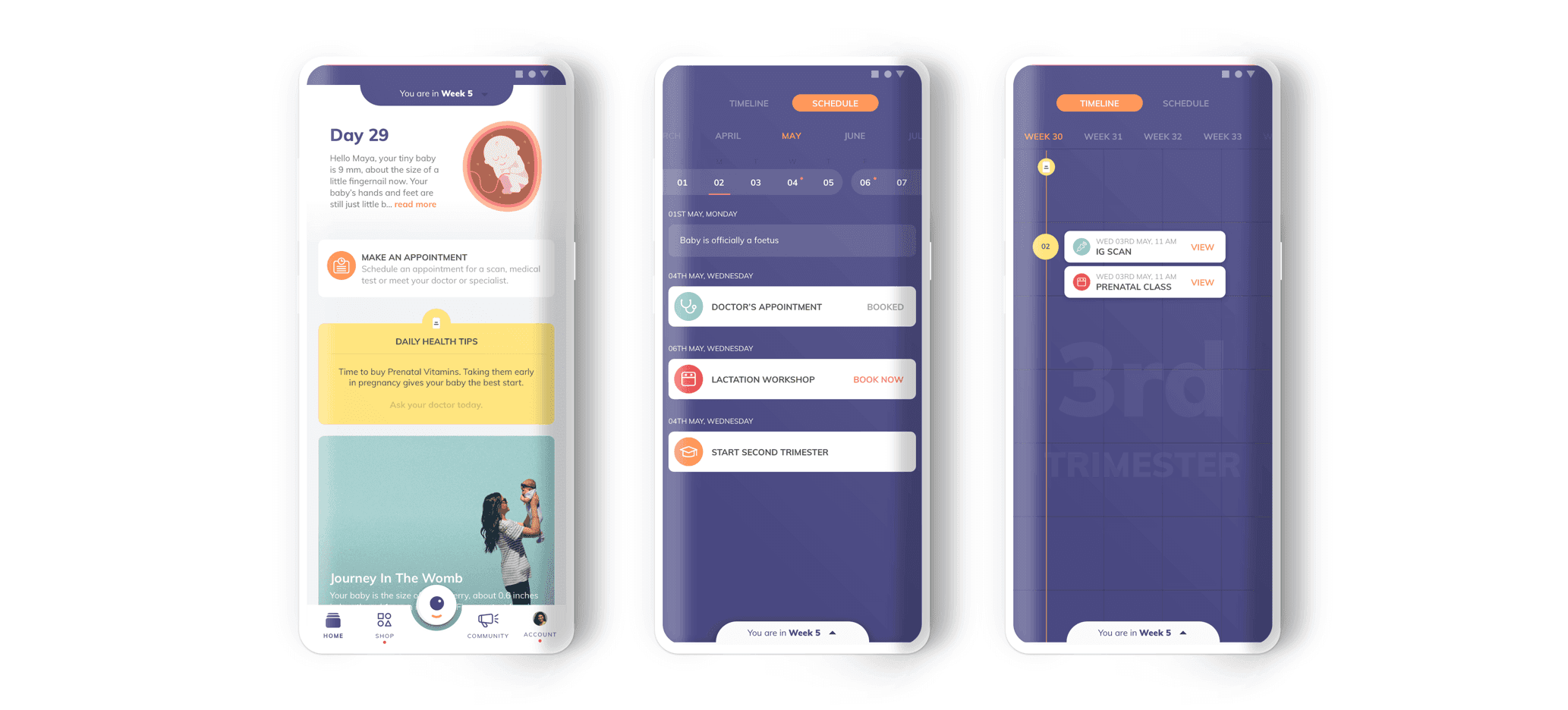
Appointment
time-slots
Our research showed that patients were currently waiting up to 2-3 hours for their appointments. It was taking 6 minutes to book an appointment via the current system of calling customer service. We streamlined the appointment-booking process on the app to an average of 1-2 minutes and in some cases, even less.
In our streamlined appointment system, patients select half-hour slots, ensuring timely consultations within that period. Arrival times determine priority, guaranteeing patients are seen promptly. For instance, if a patient books Slot B (9:30-10:00 a.m.) and arrives at 9:30 a.m., they're second in line. This system provides flexibility even if the previous slot extends, since patients are not expecting to be seen at a certain time but rather within a 30-min time slot.
To account for potential delays, some slots have vacancies. Patients who arrive late are accommodated in these slots, minimizing disruptions. By adopting this approach, we've significantly reduced waiting times, ensuring a maximum wait of 45 minutes for our patients, as opposed to 2-3 hours.

DESIGN PRINCIPLE: RELEVANT
Consultation Status
Cards on Home
Our research highlighted that excessive touchpoints in the hospital lead to dissatisfaction. To address this, we designed a seamless app experience encompassing the entire user journey within the hospital.
Users can check in, monitor their queue status, receive real-time updates on their doctor’s availability, reschedule appointments, and view post-consultation instructions, all through the app. This holistic approach ensures a hassle-free and convenient experience for our patients

We enhanced their home experience by creating dynamic consultation cards, updating based on the patient's pregnancy stage and hospital progress. Secondary cards offer tailored suggestions, such as booking a cab for upcoming appointments. An overflow menu allows appointment management without leaving the home screen. Post-consultation, detailed instructions are simplified into easy-to-follow tasks, disappearing once completed.
DESIGN PRINCIPLE: RELEVANT
Timeline
View
Our app simplifies the intricate pregnancy journey by presenting all consultations, scans, labs, workshops, and events in a user-friendly timeline. This intuitive layout allows patients to track their progress, view upcoming milestones, and review completed events.
By visualizing their journey in a clear timeline and schedule format, users find the overwhelming experience transformed into a manageable step-by-step process.
Additionally, patients can seamlessly book consultations, schedule scans/lab appointments, and RSVP for events directly from this view, enhancing convenience and engagement.

DESIGN PRINCIPLE: SUPPORT
Digital Health
Records
In our research, we identified a cumbersome paper trail in the healthcare system, where duplicate copies of documents burden both patients and hospitals. Recognizing this challenge, our app offers a vital solution: a centralized platform for storing and accessing medical records. This feature empowers patients and their support networks to navigate the healthcare journey seamlessly.
Account holders can add partners and manage multiple family accounts, fostering support networks. Consultation documents are organized systematically and can be easily searched by various criteria, from doctor names to specific dates and medications.
This streamlined system not only eliminates the need for physical paperwork but also ensures that patients receive their reports directly on their phones, even if they opt for scans outside Cloudnine.

DESIGN PRINCIPLE: LIFELINE TO ALL
Consultation
preparation
In our research, we learned that many doctors would tell their patients to put a sticky note on their folder holding medical documents and quickly jot down any questions as they come up between consultations.
In the customer app, an “Add Questions” section is accessible from the upcoming consultation card on the home screen. A user can collect all her questions for the doctor in one place and the doctor gets access to these questions before the consultation via his mobile app.
This organized approach ensures seamless communication, fostering effective patient-doctor interactions.

DESIGN PRINCIPLE: SOCIAL
Building a
Community
A great feature that some pregnancy apps have already implemented is a community. After speaking with patients, we noticed that first-time fathers, in particular, want to be more proactive in the pregnancy process but are, instead, clueless as to how to act and what to do.
The benefits of building a community for first-time parents are endless - they can have peer group support, join their due-date club, talk to more experienced parents, get emotional support for post-mortem depression, the list goes on.
Even for more experienced patients, they can find and attend events to speak about their own experiences. The app curates different content for mothers and fathers in the community

DESIGN PRINCIPLE: SUPPORTIVE
& LIFELINE
One-stop
Shop
Our research identified disparities in hospital experiences across different branches, leading to confusion for patients regarding their Cloudnine Membership Plan benefits.
To bridge this gap, we created a user-friendly 'Shop' feature within the app. This tool not only standardizes all delivery packages but also provides a clear overview of Cloudnine services, simplifying the decision-making process. Users can easily share package details with family members and make plan purchases directly from the app, allowing seamless adjustments to preferred service locations.
Additionally, the app centralizes all necessary products and services, offering a comprehensive solution from pregnancy to postpartum. Intelligent notifications guide users, ensuring they are well-prepared for every stage of their journey
NEXT STEPS
Moving forward, we realise that different apps in the hospital system can and should automatically communicate with one another. When a doctor updates their status from “Available” to “In an Emergency”, the customer app should notify patients with scheduled consultations that the doctor is in an emergency and give them an option to cancel or reschedule their appointment, preferably before they leave their homes. When a lab technician updates the doctor that a report is ready to view through the system, the doctor should be able to comment on the report. Automatically, the customer should be notified that the report is available for viewing.

The hospital experience, especially the nine-month pregnancy journey, should be as easy and trouble-free as possible. As designers, we must view this experience from a user-centric point of view and change the way these systems have been operating for decades. Making services mobile-friendly can truly revolutionise this untapped healthcare space.
IMPACT
2 million users have successfully onboarded onto Fi app. Users think the onboarding is quick and simple. It's helped thousands of Indian Millennials open a bank account completely online & start their journey towards financial awareness and independence.
66%
reduction in wait time from 3 to 1 hour
50%
reduction in touch points from 8 to 3-4
01
interface for all hospital functions
20%
reduction in steps during registration
01
doctor app that talks with customer app
Read more at https://fi.money/open-savings-account-online

Opening a Bank Account


Money Lite
Copyright © 2023 Shana. Made with 💙 in Bangalore