
Opening a Digital Bank Account

3.5 million
Fi Savings Accounts opened
5 min
Average time taken to open account
65%
Users who begin the flow complete it
INTRODUCTION
Fi is a financial management app aiming to be one place for Indian Millennials to track, save, invest, and analyse their finances. To use the app, a user must create a Savings Account during the onboarding process.
In 2020, we set out to design a streamlined and efficient bank account registration process from the ground up, ensuring that the security and compliance obligations remained uncompromised.

OVERVIEW OF THE EXPERIENCE
Joining bonus boost
Liveness detection model
Adding funds to account
THE PROBLEM STATEMENT
Setting up a bank account within India's traditional banking framework can be quite challenging, especially for young professionals. How can we enable our users to effortlessly open a 100% digital bank account, while ensuring it is straightforward, enjoyable, and legally compliant.
Scan, print, and sign your identity and address proof documents
😊 15-30 min
01
Visit the bank, wait in line, and fill out a long form with a banking agent
😕 1-1.5 hrs
02
Wait for a bank agent to review and verify your application
😒 1-2 days
03
Existing process to open a traditional bank account
RESEARCH
Fi conducted research to better understand the needs and pain points of Indian Millennials. This involved gathering insights from potential customers about their experiences with traditional banks and their expectations for a digital banking app.
SPOKE TO
10 Indian Milllennials
DEMOGRAPHIC
25-35 yr old working professionals
BANKS
0-2 existing bank accounts
GENERAL THINKING AROUND MONEY
😳 Overwhelming
3 people found finances in general overwhelming & opened accounts based on recommendation from their parents
🤐 Embarrassed to discuss
2 people felt unease talking about finances with friends, and sought advice from online resources instead
🧑💻 Keeps track on excel
2 people maintained excel sheets to keep track of their finances & had separate spending accounts
💪 Wants to improve
4 people felt need to better handle their finances - budgeting & monitoring expenses & investing
VIEW ON COMPLETELY DIGITAL BANK
💡Would try it out
3 people would be willing to try it out by putting some money and seeing how it works
😳 Hesitant to trust
2 people said they would have second thoughts about it, since the trust factor would be lost
❤️ Loves idea of no bank trip
2 people were happy with a digital bank, just so they didn’t have to visit the branch
✅ Should provide additional features
2 people said they would need something in addition current bank services to even try it out
DESIGN PRINCIPLES
We approached designing the onboarding with a clear set of principles that guided our decisions. We understood that the onboarding experience is a critical moment to engage users and set the tone for their entire journey with the app.

Quick
Our aim is to make it quick, hassle-free, & no longer than 5 minutes. We leverage auto population wherever possible and heuristics checks to eliminate redundancy.

Simple
Focus on a single action per page, provide clear visual cues to indicate where to enter details, & show progress to give reassurance & motivate users to finish the lengthy process.

Trustworthy
Give users peace of mind so they trust us with their money. Clear communication on how we prioritise security of information and highlight our strong partnership with the trusted Federal Bank.

Transparent
At each step, we consider the concerns and questions users may have, and explain why details are required. We offer easily accessible FAQs, a direct link to chat with our customer support, and we actively seek user feedback.
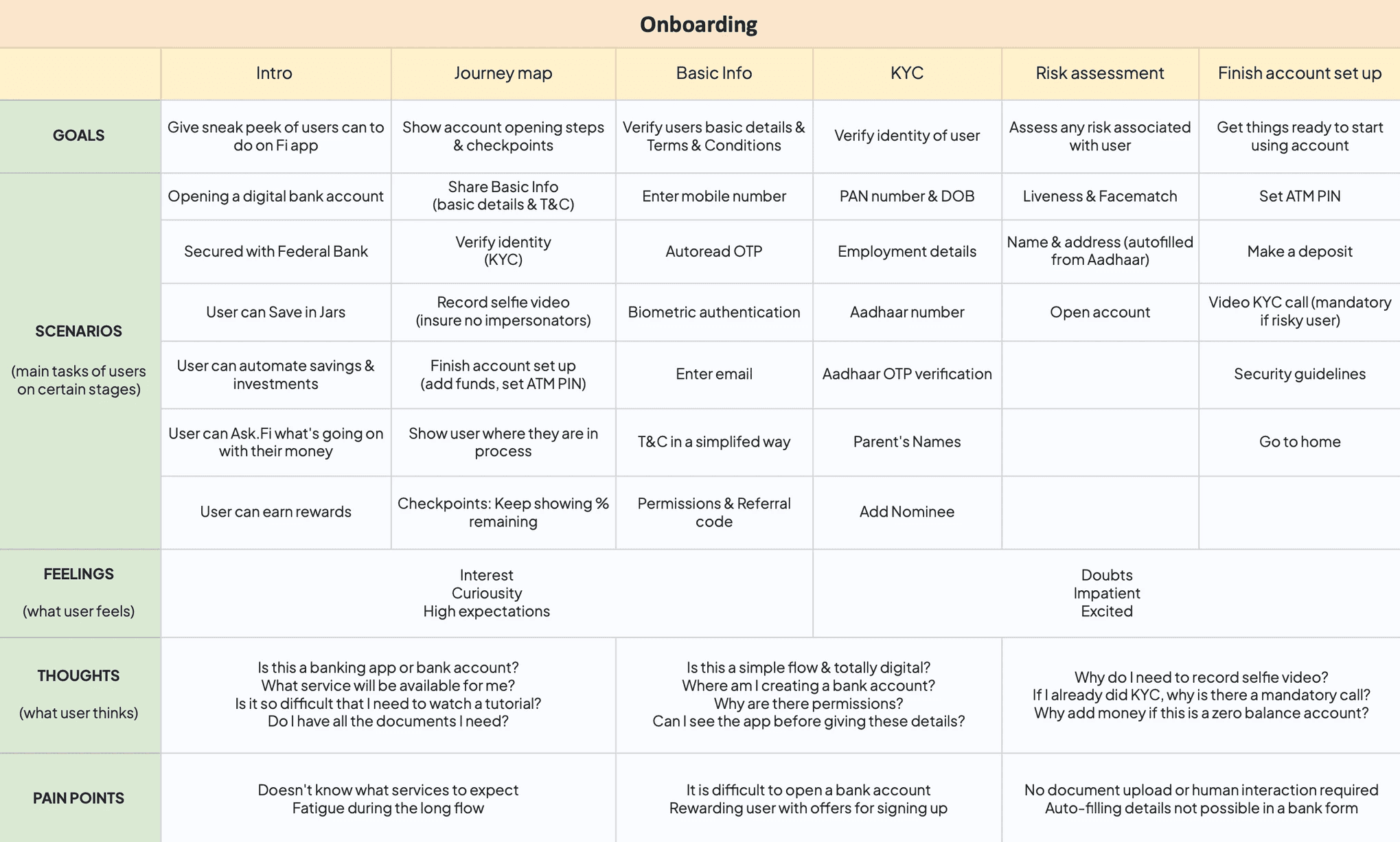
JOURNEY MAP
In this step, we combined all the collected knowledge using a User Journey Map (UJM) technique. This allowed for all stakeholders to come in a single room and get on the same page before moving to design phase. This gave us diverse & comprehensive perspectives as we charted out a plan for the MVP.
FINAL SOLUTION
Final outcome: Highlights
Each highlight captures a stage within the onboarding process. It highlights the design principle it follows, which user situation it caters to, and the provided resolution.
DESIGN PRINCIPLE: TRUSTWORTHY & TRANSPARENT
Introduction to the app
USER SCENARIO
User isn’t sure how Fi differentiates from conventional banks or its unique features and may not be convinced to open a bank account. They may also wonder about its reliability and might worry about security issues.
SOLUTION
Our flow starts with a clear value proposition. We highlight essential features visually, minimizing text and emphasizing how Fi stands out from traditional bank accounts. Instead of ‘connect your accounts,’ we use ‘track all your accounts in one place’ to address security concerns. Screens auto-scroll every 5 seconds, and users have control with the Sign Up action on the first screen.
DESIGN PRINCIPLE: SIMPLE & QUICK
Journey map &
progress indicators
According to the Goal Gradient Effect, users are more likely to carry on with a process if they feel like they're nearing their goal. We designed a journey map, taking the entire 12 step flow and drilling it down to 4 simplified steps. We displayed it users when they started each step.
In transition screens, we surface to users how much they've already completed to boost motivation and encourage completion of the journey.
DESIGN PRINCIPLE: SIMPLE
User-friendly form fields
USER SCENARIO
Users are merely people, and errors can occur during data entry. They might input their birthdate inaccurately, omit a character in their PAN number, or fail to realize they must touch the form field to enable the keyboard for input.
SOLUTION
Our form fields are designed with user-friendly hints for accurate input. For instance, we present phone numbers in two blocks of five digits, Aadhaar numbers in three blocks of four digits, and date of birth in MM/DD/YYYY format. To enhance user focus and streamline the process, the keyboard is automatically open on each page, reducing taps and allowing immediate input of details.
DESIGN PRINCIPLE: QUICK
Smartly auto-populate
long forms
To expedite the process, we automated certain steps. Our app suggests phone numbers linked to the user’s Android device, automatically populates the OTP (One-Time Password), and provides a convenient Gmail sign-in modal. With a single tap, users can auto-fill their email and name, further streamlining the onboarding experience. When we ask users for their address, we suggest addresses fetched from KYC details.
DESIGN PRINCIPLE: TRUSTWORTHY & TRANSPARENT
Terms front & center
USER SCENARIO
Since Fi isn't a known name, there is lack of trust. Users may worry about security issues and are having second thoughts about security of their money and data.
SOLUTION
To build trust, we prioritize transparency by presenting our Terms & Conditions upfront, bucketed into easy categories and written in a clear and accessible manner. I worked with copywriters to make it as easy as possible.
DESIGN PRINCIPLE: TRUSTWORTHY
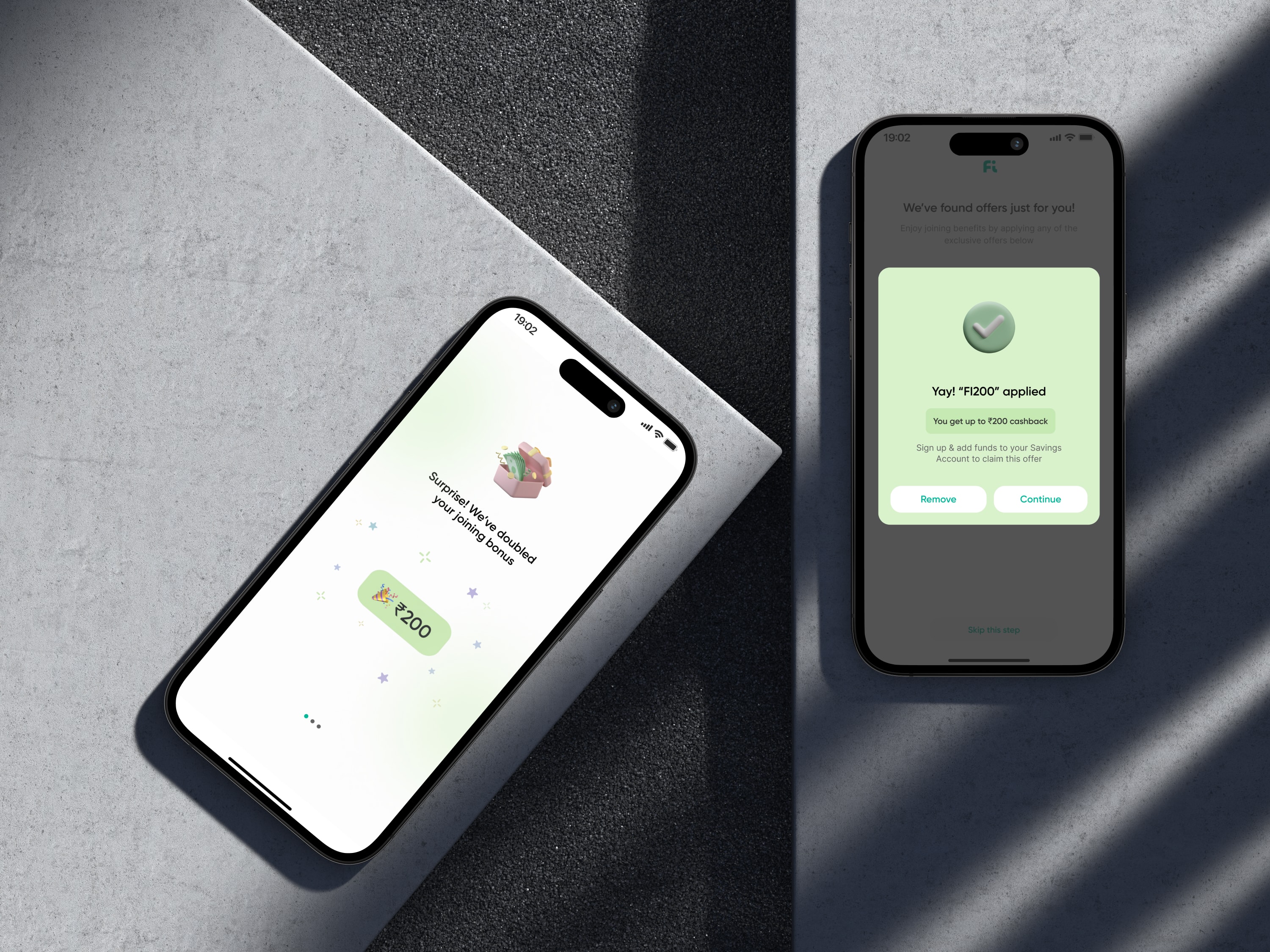
Referral code & joining bonus
We added a referral code option to motivate users to finish onboarding & avail their joining bonus. In areas where drop-offs are higher, we strategically remind users of the referral offer to increase their incentive to proceed.
We also give affluent users a bump in the joining bonus if their credit score is above a certain amount! This gives them a feeling of delight, and hopefully some more motivation to finish the process.
DESIGN PRINCIPLE: TRUSTWORTHY
Verifying identity with PAN card
USER SCENARIO
A PAN is essential for opening an account with our associate Federal Bank, and requesting users to divulge their information prior to app exploration may result in decreased engagement.
SOLUTION
We emphasized the Federal Bank partnership, added social proofing, & ensured compliance. If a user tried to exit the flow, we introduced a bottom sheet highlighting the importance, security, and benefits of sharing their PAN details.
For users who want to explore the app before sharing their details, we offer the option to skip this step and access a light version of the app, providing a glimpse of the app’s functionality and interface.
DESIGN PRINCIPLE: TRANSPARENT
Checking a user's eligibility for Fi
Fi is for working professionals. We implemented a two-step process consisting of mandatory details collection and an employment check. For essential details, we used multiple-choice options to simplify the form, enabling users to complete it in just 4 taps.
For the employment check, we used sequential options to prevent overwhelming users. We first asked for credit score so we could check their details from the credit bureau. For users who preferred not to share, they could verify their work email ID. If skipped, users could choose their employer from a list, connect another bank account for scanning, or could connect their Gmail account. If all attempts were exhausted, we displayed the remaining options. This approach reduced cognitive load as users progressed through each stage at least once.
DESIGN PRINCIPLE: TRUSTWORTHY
Impersonation Check
USER SCENARIO
This step helps detect and prevent fraudsters from impersonating users.
SOLUTION
We implemented a Liveness and face match detection model for enhanced security during identity verification. Users record a video of themselves speaking a 4-digit code, which is then compared with their PAN card photo. The liveness model ensures that the person being verified is physically present and actively participating in the process, adding an extra layer of security against static images or recordings.
DESIGN PRINCIPLE: SIMPLE & QUICK
Live video call for KYC verification
We simplified document submission. Instead of scanning, printing, signing, and submitting identity and address documents, users only need to show their physical PAN card to a bank agent during a 3 minute long video call. This saves time, effort, and ensures compliance with the required verification process.
This step is usually mandatory, but for users who were deemed less risky or came from an affiliate, we allowed them to do this later once in the app.
DESIGN PRINCIPLE: TRUSTWORTHY
Adding money to account
USER SCENARIO
Users will need funds in their account to avail all of Fi's features, like make UPI payments, invest at 0% commission, analyse spends, unlock rewards, etc.
SOLUTION
We introduced suggestions below the amount, and highlighted the benefits they would unlock with each amount. As user selected higher amounts, they would unlock more benefits. We handled curiousity with a help icon which shared a detailed FAQs page covering concerns about security, limited amount, etc.
DESIGN PRINCIPLE: SIMPLE
When users hit a bump in the road
Our partner bank can face 100+ issues while opening a bank account. The top 5% of problems happen 90% of the time. What happens if a user faces an issue and cannot move forward in a stage.
We give contextual reasoning as to why they're stuck, how long the problem may take to get fixed, and offer help in the form of customer support. We actively seek user feedback, demonstrating our commitment to continuous improvement.
We handled this elegantly by creating templates and keeping them configured in the backend.
NEXT STEPS
In our continuous efforts to enhance user experience, we recognize that individuals approach the Fi app with diverse intentions. Some might be interested in credit card services, while others seek loans, and some are here to optimize their banking experience with Fi. To address these varied needs, we will introduce an intent screen during the onboarding process that will allow users to specify their purpose for using the app, enabling us to personalize their journey accordingly.

By understanding the user's intent upfront, we can tailor the app experience to align seamlessly with their goals. For instance, users focusing on credit card services will find card controls prominently featured, ensuring effortless management without unnecessary distractions like investment promotions. Similarly, those seeking loan options will discover a tailored interface designed specifically for their needs. Our aim is to create a tailored, user-centric environment where everyone feels at home, regardless of their financial requirements.
IMPACT
3 million users have successfully onboarded onto Fi app. Users think the onboarding is quick and simple. It's helped thousands of Indian Millennials open a bank account completely online & start their journey towards financial awareness and independence.
Read more at https://fi.money/open-savings-account-online
3.5 million
Fi Savings Accounts opened
5 min
Average time taken to open account
65%
Users who begin the flow complete it
FROM THE PLAY STORE
“Awesome experience! Simple intuitive UI. Sleek animations. Amazing UX. Beautiful onboarding experience! All in all - best Neo bank app..”

Rishabh Raizada
Freelancer
“Very easy way of account opening process, it just took around 10 minutes & the app is absolutely brilliant..Kudos to federal Bank...!.”

Nandan Mahesh
Entrepreneur
“Really liked Fast and Instant account opening and not go out. I love Fi Money UI. Seems Cool”

Sakshi Raheja
Salaried professional


Copyright © 2023 Shana. Made with 💙 in Bangalore