
4X
increase in savings every month
60%
increase in Deposits
opened
45%
Fi users have used our feature at least once
INTRODUCTION
Fi is an Indian banking app that helps over 3 million millennials demystify their savings and simplify their finances.
We were tasked with designing a feature that encourage users to save more money using Fi.
MY ROLE
Concept ideation · Aligning key stakeholders · User Experience Design (UED) · Process Design · Visual design · Prototyping · Quality assurance
TEAM
1 Product Designer, 1 Product Manager, 1 Graphic Designer, 3 Engineers
TIMELINE
Dec 2020 - May 2021

THE PROBLEM STATEMENT
Most millennials are aware they need to save, but when it comes time to do so, either they don’t know where to start or they simply forget to do so. Who can blame them, the thought of it just sounds boring! How can we make saving money fun, feel easy & hassle-free, and help Millennials reach their savings goals faster?
UNDERSTAND & SCOPE
In a product discovery sprint, we put our minds together to identify areas of opportunity. We asked ourselves the key questions:

Then we realised, why don’t we automate savings just the way you’d automate a subscription?
Benefit is, users can go about their lives, and in 6 months have enough money to fund a holiday or a new iPhone. And that's when the idea of FIT (IFTTT) rules came to be. With automation idea in place, we took it one step further.
MAKING IT FUN
FIT Rules allow users to automatically move money from their savings account to mutual funds or jars. Just set up a rule once and watch your money grow. Instead of limiting ourselves to a date as a trigger for our rules, we thought outside the box. Why not make it any action? For example, when a user orders takeout, a cricketer hits a boundary, a celebrity tweets, salary credits to your account, and more.

OUTLINING A COMPELLING UX
We identified 3 high level flows that a user would perform at different parts of their journey.

STORYBOARDING THE FIRST-TIME USER
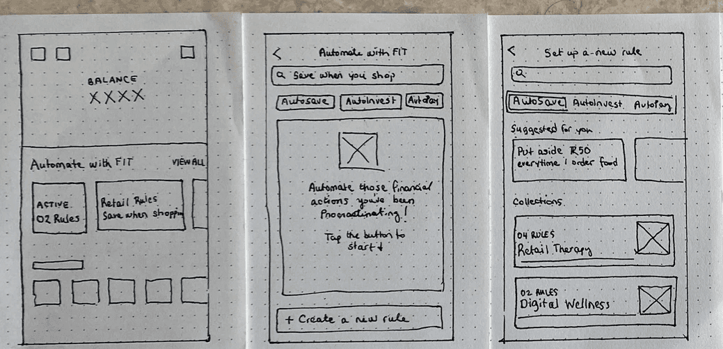
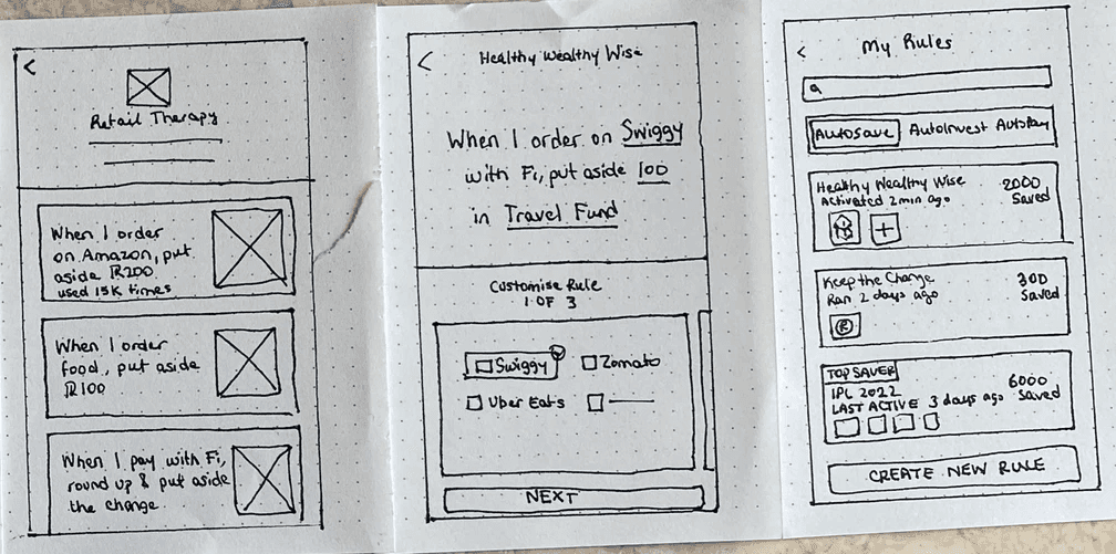
Storyboarding the first-time user flow: from the entry point on home, to exploring rule collections, to customising the rule & activating it, to viewing active rules.
CONCEPTS
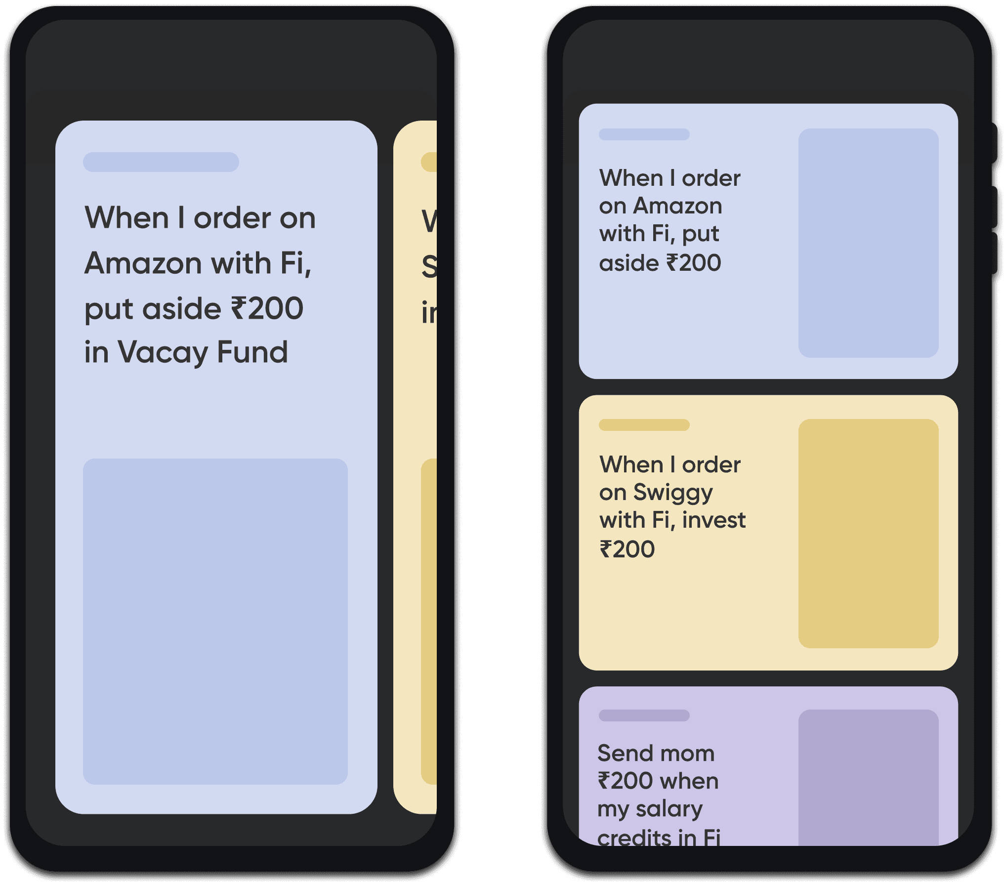
We generated 3 rule concept directions & after presenting them in critique, decided to use short cards, collections of rules, & one-click rule activation
CONCEPT 1
Format rules in long
cards or short ones
Long cards have room for cool visual elements, but show 1 card in a single scroll. If a user isn't interested in first 3 rules, they may lose interest. Smaller cards have less room for visual elements, but shows 2-3 cards in a scroll.
CONCEPT 2
Explore with Collections
or by individual rules
How do we organise the rules? Collections are scalable, but increase cognitive load. A list of individual rules upfront would be a long list, but rule descriptions are self explanatory.

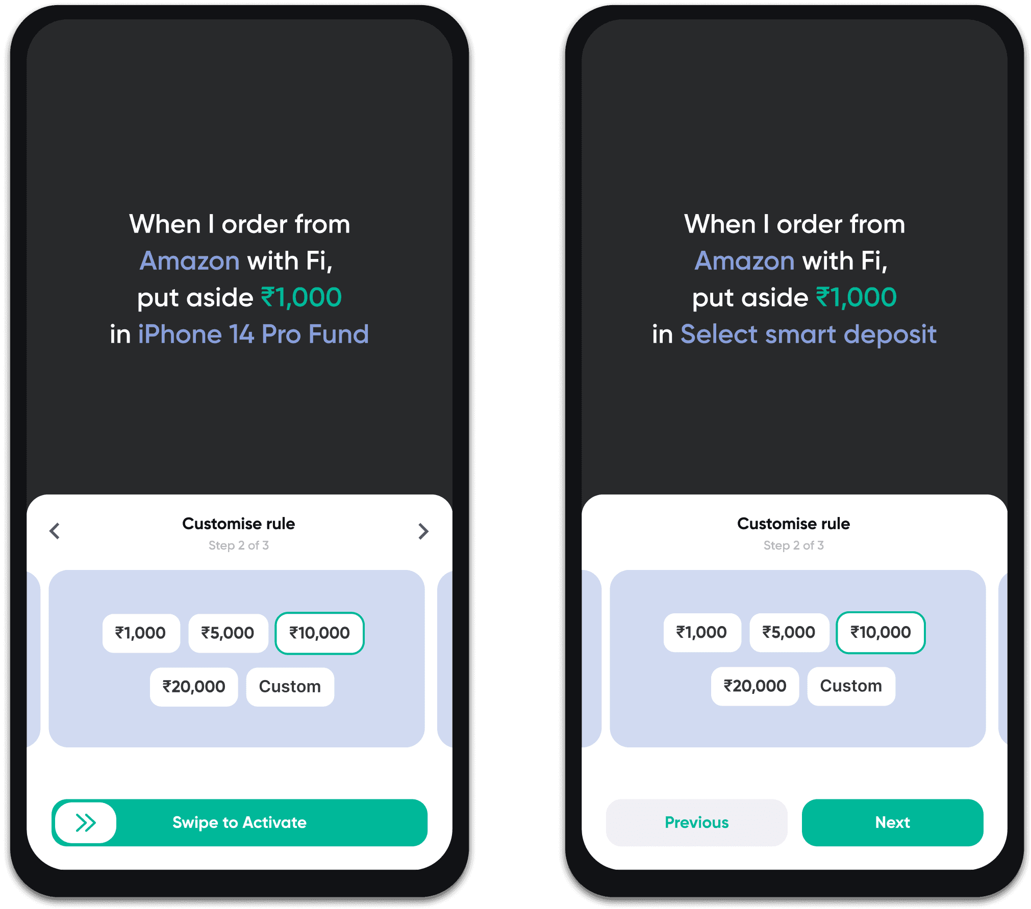
CONCEPT 3
Activate rule in 1 tap
or step by step
Activating in 1 click reduces friction & helps user to take a decision. Having steps would help users go through all parameters before activating. Also, users who are just browsing won’t accidentally activate the rule if it has steps.
TEST AND REFINE
To find any loopholes or challenges a user may face, we conducted mid-point research.I recruited some users to test the prototype internally, instructing them to go through the first time user flow & voice their concerns. These insights were taken as improvement in the refinement stage of design.

Simplify deposit creation
Before activating a rule, we re-direct to the 5-step smart deposit creation flow. Users found the flow complex and long. This is a potential drop off point, we can aim to simplify this flow.
🤩 Fun images peak user's interest
While browsing, users found the images used in the cards fun to look at, and felt more compelled to explore the rules because of them.
⚖️ Rule cards explain the concept really well
Users understood FIT rules completely by simply reading Rule cards on home. So for first time users, we can have Rule cards on home, and once they're more seasoned we can show collections on home.
🚥 Rule activation should be a swipe
Users who were just browsing were accidentally activating rules in 1-tap, causing confusion. Instead of a button, we can add a swipe button to ensure accidental clicks don't occur.
FINAL SOLUTION
Final outcome: Highlights
Each highlight captures the FIT Rules feature, including the navigation, finding a perfect rule, activating it, and managing them. We also show our fun feature, Fi Savings League.
Introducing FIT Rules
Users are unfamiliar with the concept of automating their finances, so we needed to explain it to them up in a simple way they could understand. On the home page, we introduced a FIT Rules carousel comprising a dashboard card, 2-3 rule cards, and a view all card leading to explore more.
DYNAMIC DASHBOARD
When users start fresh, the card is an intro card. As a user activates a few rules, it becomes a summary card displaying various stats, such the number of active rules or amount saved/invested. Tapping on 'View All' will take you to the FIT Rule landing page.
SERVER-CONTROLLED RULES
We show a mix of 2-3 trending rules & rule collections on home. If there's something we want to feature, it comes to the first position. Tapping on it will take to a rule customisation page directly.
Exploring Rule Collections
A user exploring FIT rules for the first time may get overwhelmed by the number of rules there are. Instead of just having a listing view of all rules, we grouped rules into collections for easier browsing.
RULE HIERARCHY
First, we split the page into 3 tabs for the 3 rule types: AutoPay, AutoSave & AutoInvest. Inside each, we presented rule collections which grouped similar rules. We used 2D & 3D images to add a quirky element that would keep the user intrigued while they browed.
Finding the perfect rule
FROM HOME
A user can explore popular rules & collections from the home carousel. This increased top of funnel conversions by 8% by reducing the steps it takes to get to rule activation.
FROM EXPLORE
If user chooses to browse all rules, they can go to the explore page. Inside, they can browse rules by collection. Once they find a rule they want to activate, they're taken into the customisation screen.
Activating a Rule
When a user lands on this screen, they see it's splits into a summary of the rule on top and editable parameters on the bottom.
1-CLICK ACTIVATION
To minimize decision-making for users, each rule already has default parameters applied to them. If a user finds them ok, they can go ahead and swipe to activate in 1-click.
CUSTOMISING THE RULE
Editing parameters on the bottom updates the rule on top. Tapping a parameter on top will jump to its card below. When users are ready, they can swipe to activate. This avoids users from accidentally activating the rule, and makes it feel like a final step in the flow.
Managing Your Rules
TYPES OF CARDS
After activating a few rules, users can find them in My Rules. There are three types of rule cards: single rule, multiple app rule, and tournament rule. Tournament cards will direct users to a listing page displaying all the rules for that specific tournament. Single rule cards will lead to a listing page showing applications, and from there, users can proceed to the details page.
MANAGING RULES
In the details page, user can edit, archive, or pause their rules, and view history of their rule. They can also view stats about the rule & share progress with their friends.
Adding Automation to
deposit creation flow
Users who come to the app for a singular action like save or pay might miss the FIT Rules completely. For easier discoverability, we weaved FIT rules into existing flows in the app.
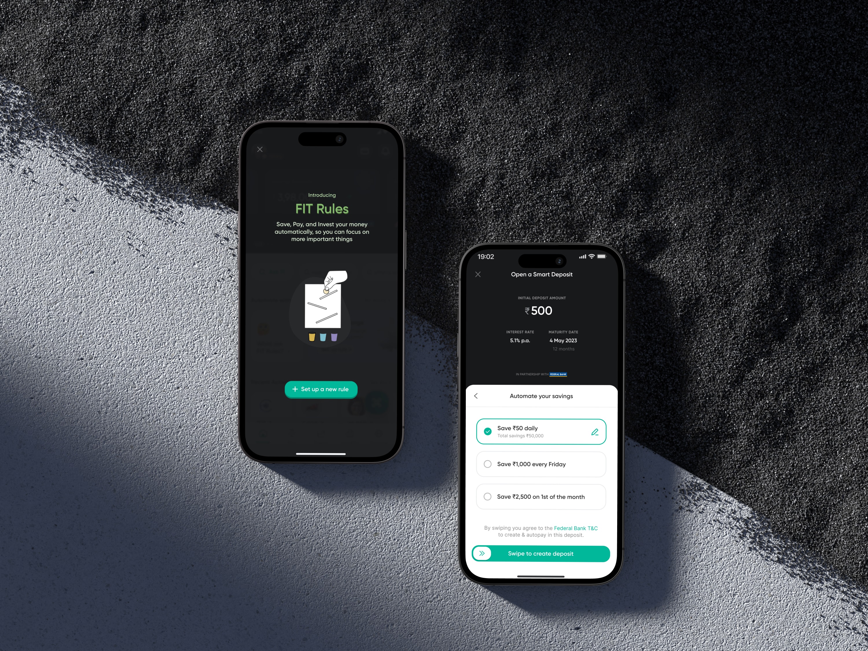
AUTOSAVE IN SMART DEPOSIT CREATION
We added the AutoSave option as the last step of the Smart Deposit creation flow. We plan on introducing AutoPay into recurring payments like subscriptions and AutoInvest in the Invest landing page so users can find it contextually.
IMPACT
1.65 million users are successfully using FIT Rules & creating money habits without even realising it. Users have found the rules super fun & unique. Though we've just scratched the surface of FIT rules potential, here are a few metrics to show how we're doing so far.
4X
increase in savings every month
60%
increase in Deposits
opened
45%
of all users have activated at least 1 FIT Rule
See all FIT rules at https://fi.money/features/fit-rules
NEXT STEPS
Moving forwards, I know we can improve a lot. Using AI, we can suggest a bill pay rule to users that clubs all the user's bills into 1 single rule. They can then activate and forget it, all your electricity, phone, water bills will be taken care of. Further, if a stock dips by a certain percentage, invest 5 bucks in it. Other than AI, users can create custom rules, where someone can choose multiple actions in one rule like save and invest when I shop on Amazon and order takeout.

Maternity Hospital App


Money Lite

Copyright © 2023 Shana. Made with 💙 in Bangalore
